

The New Yorker came out with an impressive interactive infographic that makes a sad American problem interesting to navigate. Income inequality is particularly acute in New York City, according to recent data from the U.S. Census Bureau, and Larry Buchanan maps it out on the city’s subway. We took a digital ride on each line and took note of the median household income at each stop. Here’s a snapshot of that journey at a couple of stops on Line 1:
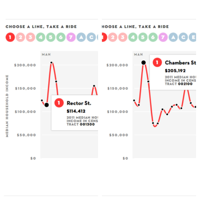
The infographic charts dramatic changes between boroughs and neighborhoods. Manhattan’s income gap between the richest 20 percent and poorest 20 percent was on par with countries like Sierra Leone, Namibia and Lesotho, The New Yorker reports. Other highlights include a highest median income of $205,192 at the Chambers Street, Park Place and World Trade Center stations, a lowest median income of $12,288 at the Sutter Avenue stop on Line L in Brooklyn and a largest range in median income of $191,442 on Line 2 .
The interactive got us wondering what further conclusions could be drawn about disparities within individual lines and the boroughs along the way – Brooklyn, the Bronx, Manhattan and the Queens. So we went ahead and found the average median household income for all 21 lines and came up with this chart displaying them from highest to lowest:
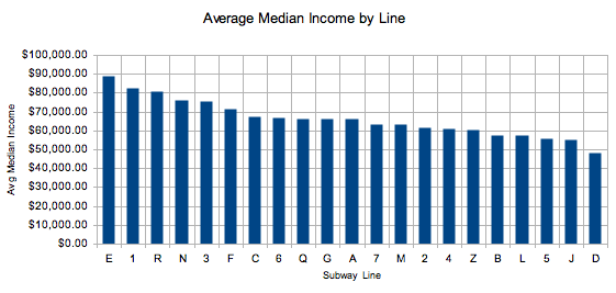
Line E had the highest average median income at $88,888, while Line D had the lowest at $48,203, an 84.4 percent deficit. All six lines with the highest incomes, all above $70,000, included stations in Manhattan. Only Line 1, which ranked second highest at $82,638, included stops in the Bronx. That got us curious about average median incomes per borough, so we created a separate chart, pulling out duplicate median income values because it is assumed they are in the same neighborhood.

Unsurprisingly, Manhattan came out on top with an average median income of $84,510 and the Bronx dead last at $33,676. What surprised us is how close the average medians for Brooklyn and Queens came out – $49,014 and $54,274, respectively. This just skims the surface of what could be a long analytical journey into other societal problems as they relate to income like ridership numbers and crime rates for each line or borough, or even a platform for comparison to this disillusioning map by Max Fisher of The Washington Post on how 35 countries compare on child poverty (the U.S. is ranked 34th).
The takeaway from our analysis so far, though, is something you may or may not already know depending on your average median income. If you’re in the middle to low range, you’ve probably used the subway enough to see the disparities, whereas if you’re a resident at Park Place, your go-to transportation may not be the subway that exposes these gaps. But we could be wrong.
Want to add to this story? Let us know in comments or share ideas for stories on the Open Wire.

